How to pair a phone with a sensor
February 26, 2022How to take an observation note
February 26, 2022How to record a session and view your data
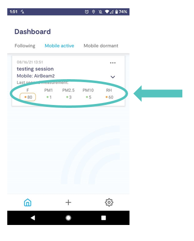
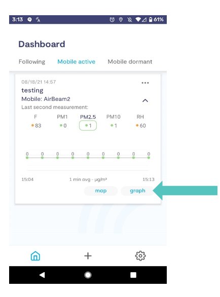
When you start recording a session, the first screen you see is a dashboard that shows the current values being measured by your air sensor.
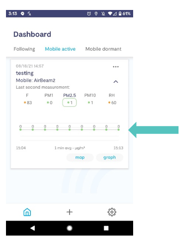
If you click on PM2.5, you will see a time series graph of the data over time. These are the values averaged over a minute.
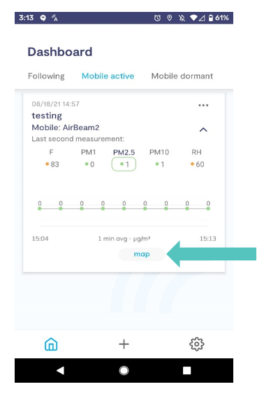
To view your data on a map:
From the mobile active dashboard screen, select map.
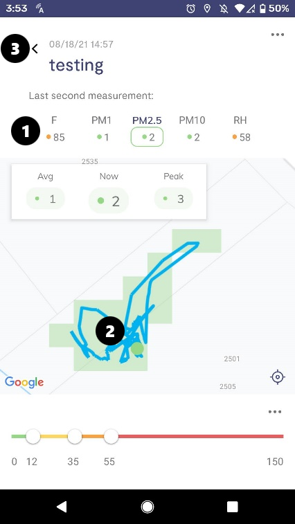
(1) To change the data you are viewing, simply click on one of the other parameters.
(2) This map shows the path you have travelled and then charts the data on a grid. The colored squares show the average level measured in that area.
(3) Click the back arrow to return to the dashboard.
To view your data per second in a graph:
Clicking on graph will open a more detailed time series of the data.
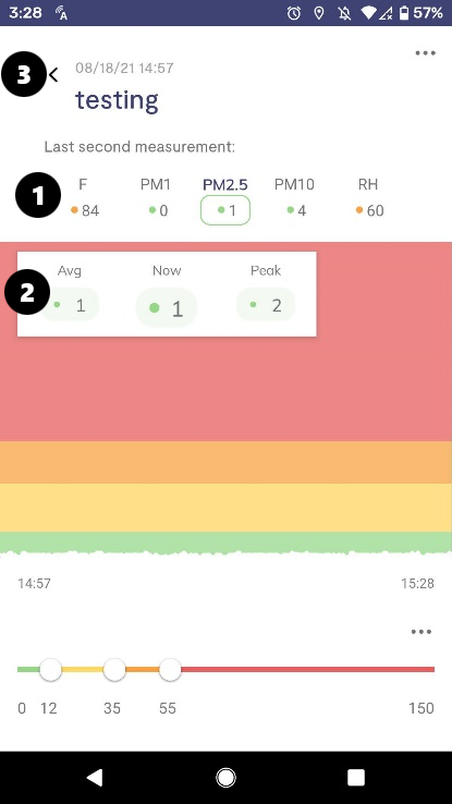
(1) To change the data you are viewing, simply click on one of the other parameters.
(2) This graph shows the time series of each data point recorded (one point per second) as a white line.
The graph also shows the:
- Avg: The average of all PM2.5 measurements you have taken.
- Now: The current PM2.5 value. This is the best one to look at to see what PM2.5 level you are currently measuring.
- Peak: The highest value measured during your session so far.
(3) Click the back arrow to return to the dashboard.